Beyond the Numbers: Understanding Your Diet with Charts
Scanning labels with Luminatens is the first step towards greater food awareness. But what do you do with all that data? Numbers alone can be hard to interpret. That's where Luminatens' charts come in: they transform raw data into clear, immediate visualizations, helping you understand your habits, monitor progress, and achieve your wellness goals
In this guide, we'll explore the different types of charts you'll find in the app's Analytics page, explaining what they show and how you can use them to "visualize your victories" in nutrition, even if you're not a statistics expert! Remember you can always filter almost all charts by time period (today, week, month, year) using the calendar icons
Your Visualization Tools
Here's an overview of the available charts, in the order you might find them useful
Radial Bar Chart (Daily Goal Progress)
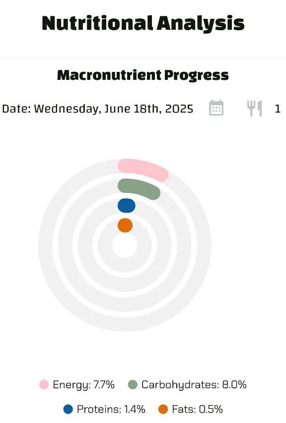
- What it ShowsThis is your personal dashboard! It indicates how close you've come to yourdaily goals(set in your profile) for Carbohydrates, Proteins, Fats, and Energy (calories). It's basedonly on the foods you've scanned AND added to your consumptionfor that specific day, selectable via the calendar
- How to Read ItEach colored ring represents a goal. The ring fills up as you add consumed foods for the selected day. The goal is to reach 100%. If you exceed 100%, the ring turns red in the excess portion. Calendar days are colored based on goal achievement (green=met, yellow=partial, red=missed/exceeded)
- Why it's UsefulIt's the only chart that measures youractual consumptionagainstyour specific targetsPerfect for seeing if you're on track with your diet day by day
Pie Chart (Total Scan Composition)
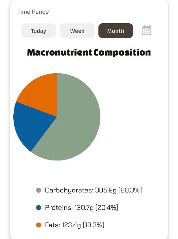
- What it ShowsThe percentage breakdown of thetotal gramsof carbohydrates, proteins, and fats present inall the foods you have scannedduring the selected period (today, week, month). It doesnotrepresent what you consumed, but the absolute nutrient composition of the products you examined
- How to Read ItIt calculates the total sum in grams of each macronutrient from the scanned foods in the period, then shows the percentage of each out of the total grams of the three macros
- Why it's UsefulHelps you understand, in terms of weight, which macronutrient was predominant in the products you scanned during the chosen period
Line Chart (Average Scan Macro Trends)
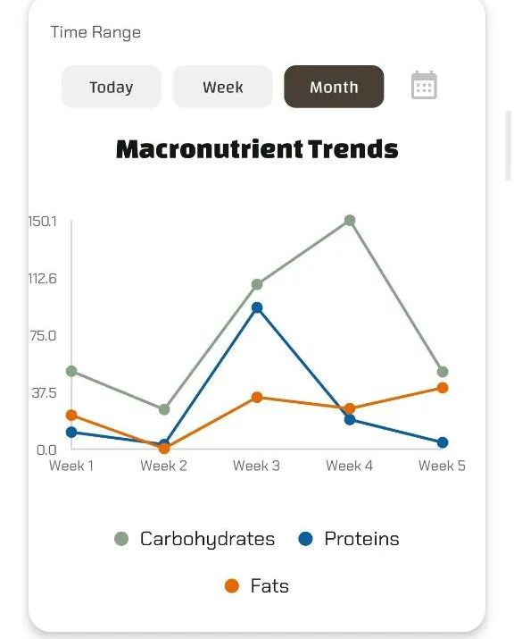
- What it ShowsHow thedaily averageof macronutrients (Carbohydrates - green, Proteins - blue, Fats - orange) present in the foodsscannedhas varied over the selected period
- How to Read ItIf you select "Today" or "Week", the lines show thedaily totalsscanned. If you select "Month" or "Year", the lines show thedaily averagecalculated for that longer period (total nutrient / number of days in period). Follow the lines to see the average trends of the products you examine
- Why it's UsefulShows if the average nutritional profile of the products you are considering is changing over time (e.g., are you starting to scan products with higher average protein?)
Contribution Graph (Heatmap - Scan Frequency & Details)
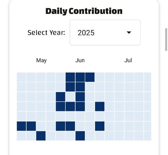
- What it ShowsThe days on which you performedat least one scanIt doesn't show quantities, only if and when you used the app to scan
- How to Read ItIt's a calendar-style grid. Days you scanned are colored (darker = more scans). Hovering over (or tapping) a colored day reveals thedetails of individual scansfrom that day: food name, assigned category, and the precise scan time. You can select the year to display
- Why it's UsefulGives you an immediate overview of your consistency in using Luminatens to check products and allows you to easily find what you scanned on a specific day
Radar Chart (Absolute Values of Scanned Nutrients)
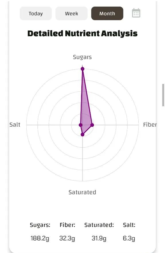
- What it ShowsThetotal absolute values(in grams) of specific key nutrients (Sugars, Fiber, Saturated Fats, Salt) accumulated fromall the foods scannedin the selected period
- How to Read ItEach "spoke" of the web is a nutrient. The point on each spoke indicates the total grams of that nutrient present in all products scanned during the period. The shape formed by connecting the points shows the cumulative profile for these key elements in the products examined
- Why it's UsefulAllows a quick check on the total amount of critical nutrients present in the products you reviewed over a given period
Stacked Bar Chart (Scan Categories by Diet)
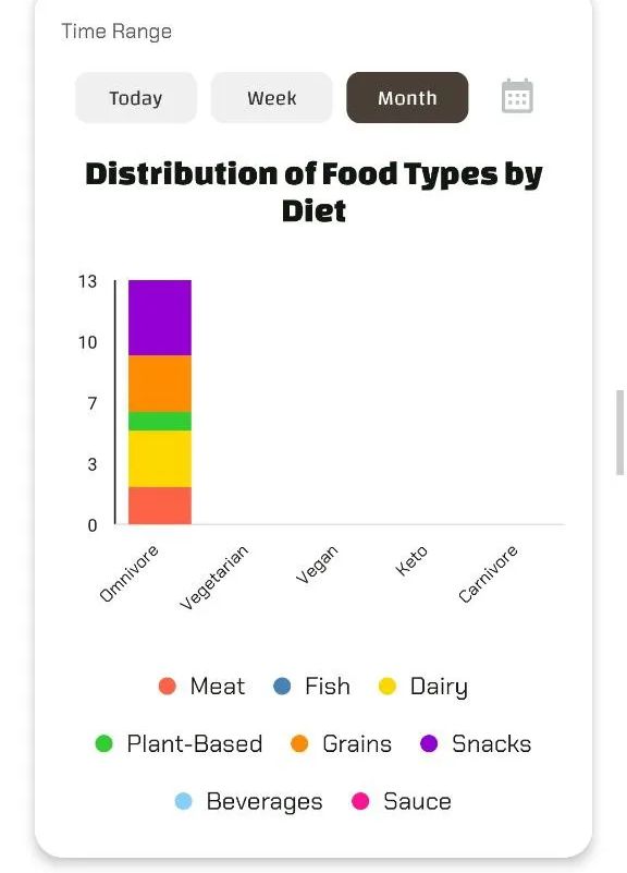
- What it ShowsThe percentage distribution oftypes of scanned foods(e.g., Meat, Fish, Dairy, etc.) grouped by thediet profilethat was active when you performed the scan
- How to Read ItEach vertical bar represents a diet profile you've used. The bar is divided into colored segments, each color corresponding to a food category. The height of each segment shows the percentage of scans for that category within that diet profile
- Why it's UsefulHelps you understand which food categories you tend to examine most depending on the diet you are following or considering at that time
Word Cloud (Frequently Scanned Food Names)
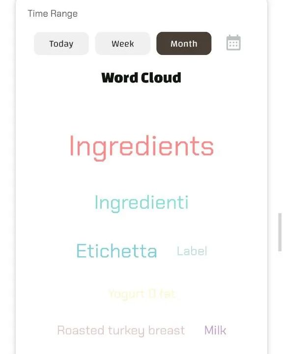
- What it ShowsThenames(either assigned by you or default names) of the foods you havescannedmost frequently in the selected period
- How to Read ItLarger words are the foods scanned most often
- Why it's UsefulProvides a different, immediate visual of the specific products that capture your attention most or are part of your scanning routine
Scatter Plot (Relationship Between Scanned Macros)
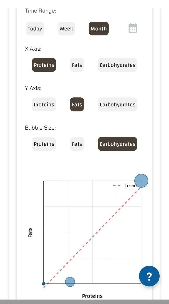
- What it ShowsExplores the relationships between macronutrients present in thefoods you have scannedYou can choose which two macros go on the X and Y axes, and which third macro determines the size of the "bubbles" (points)
- How to Read ItEach bubble is a scanned product. Its position indicates the levels of the two macros on the axes (per 100g). Its size indicates the level of the third macro (per 100g). Look for clusters or the trend line (if present) to understand correlations in the products you examine
- Why it's UsefulFor advanced analysis of the composition of products you examine. It allows you to see, for example, if the high-protein products you scan are also high in fat
Box Plot (Distribution of Scanned Nutrient Values)
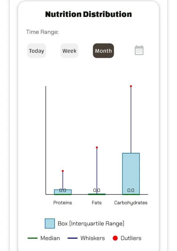
- What it ShowsHow the values of a single nutrient (e.g., Sugars) vary acrossall the different products you have scannedin a given period. It shows the distribution and variability of values, not an average
- How to Read ItThe central "box" shows where the middle half of the values lie (from 25th to 75th percentile). The line inside is the median (the middle value). The "whiskers" show the range of the most common values, and outlier dots indicate products with exceptionally high or low values for that nutrient
- Why it's UsefulHelps you understand the nutritional variety of the products you're considering for a given nutrient
Nutritional Score Analysis (Average Quality of Scans)
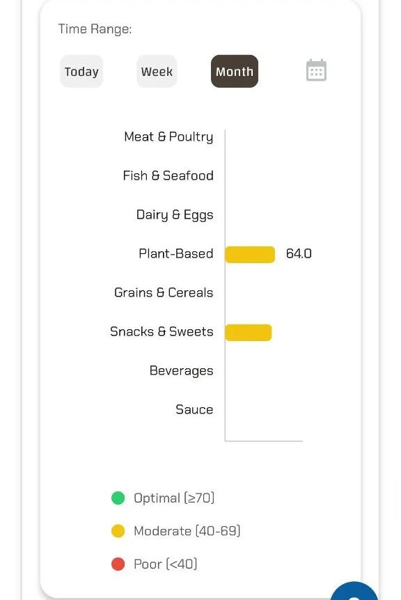
- What it ShowsAn assessment of the average nutritional quality of thefoods scannedbased on scientific guidelines (EFSA/WHO) and the diet profile selected at the time of scanning
- How to Read ItThe chart (often horizontal bars) shows the average score per food category. Colors indicate the quality range (green=optimal, yellow=moderate, red=poor)
- Why it's UsefulGives an idea of the average nutritional quality of the products that catch your eye, broken down by type
Period Comparison (Average Scan Variation)
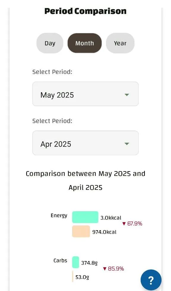
- What it ShowsHow the average nutrient values offoods scannedhave changed between two different periods you select (days, months, or years)
- How to Read ItShows the percentage change (+ or -) for each nutrient, comparing the average of products scanned in period A with the average of period B
- Why it's UsefulAllows you to see if the average nutritional profile of the products you are considering has changed between periods (e.g., are you looking at lower-sugar products on average this month compared to last?)
Conclusion: Your Data, Your Awareness
Luminatens' charts are designed to be more than just visualizations: they are tools to better understand your scanning habits and the characteristics of the products that interest you. Only the Progress Ring reflects your actual consumption against your goals. All other charts analyze data from yourscans
Explore the Analytics section, use the time filters, and uncover the insights hidden in your data. Luminatens gives you the tools to turn information into conscious action
Start visualizing your progress and discoveries with Luminatens today!
Leave a review